 SnipCSS Kiwi
 How to use SnipCSS
Steps to create a snippet
- After installing the extension, click the SnipCSS icon in your browser. (It may be hidden under the puzzle-piece icon if not pinned.)
- Select the target element or section on the webpage.
- Press Run SnipCSS to extract the associated HTML, CSS, and assets of that element — only the related styles are extracted.
Tips for best results
- Include the same-dimension parent container: use the "Select Parent" button after selecting to include the largest container that wraps only that element.
- Watch the element count: check the number of selected elements in the floating panel — over ~800 is probably too large to be a reusable component.
- Customize with options: turn on Tailwind in the Options page. When Tailwind is checked, the primary output in the preview is the Tailwind output.
SnipCSS options page
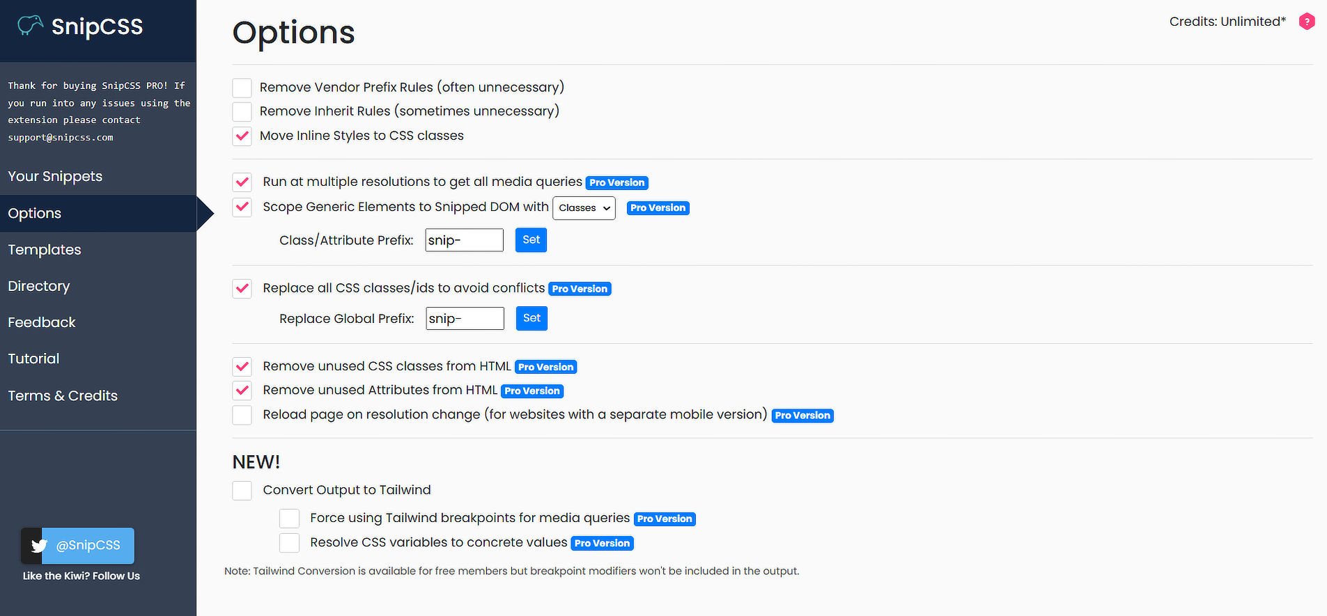
To open the Options page, right-click the extension icon (sometimes hidden under the puzzle piece) and select "Extension Options".
Now free: every option below is unlocked by default. The ones that used to require Pro — multiple resolutions, unused CSS/attribute removal, and class replacement — are turned on automatically for new installs.
General settings
- Remove Vendor Prefix Rules — removes vendor-specific prefixes (e.g.
-webkit-,-moz-) from CSS properties. - Remove Inherit Rules — omits inherited CSS properties that are often unnecessary.
- Move Inline Styles to CSS Classes — converts inline styles into reusable CSS classes.
Advanced settings (on by default)
- Run at Multiple Resolutions — extracts all media queries by analyzing the website at different screen sizes.
- Scope Generic Elements to Snipped DOM — scopes generic elements using classes or data attributes. Set a custom prefix (default
snip-). - Replace All CSS Classes/IDs to Avoid Conflicts — ensures all extracted classes/IDs are uniquely named. Set a global prefix (default
snip-). - Remove Unused CSS Classes — strips unnecessary classes from the extracted HTML.
- Remove Unused Attributes — removes unused attributes to declutter the extracted HTML.
- Reload Page on Resolution Change — reloads the page during resolution changes to capture desktop-only/mobile-only CSS (most sites don't need this, but some serve different stylesheets per device).
- Convert Output to Tailwind — converts extracted CSS to Tailwind classes.
- Force Using Tailwind Breakpoints for Media Queries — uses the closest appropriate Tailwind breakpoint instead of custom ones defined in the page.
- Resolve CSS Variables to Concrete Values — recursively resolves variables to their value before applying the Tailwind class.